The NBA Cup. It just means more.
Well, maybe not yet. It is slowly starting to kind of mean a little bit more. Which is good! One year at a time is the only way that traditions can grow.
The NBA is doing its best to make the NBA Cup matter though, and part of that effort is the new-look home courts that each team debuts for its NBA Cup games. With the NBA Cup tipping off in full tonight, we decided it was time to rank those fantastic courts.
But why rank these basketball courts as basketball courts? Every media outlet is doing that. Instead, here is a definitive ranking of the NBA Cup courts across the league based on how they would look as a rug in my bedroom.
30. Indiana Pacers
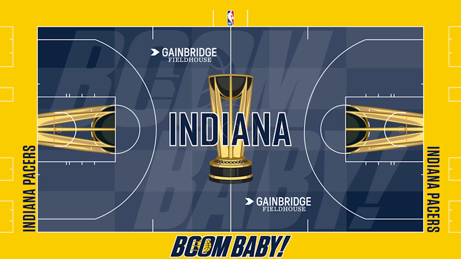
I had hoped we were past the bright yellow courts after the first year of the NBA Cup experience, and I guess we can celebrate the fact that it’s the out of bounds area rather than the court that is such a brash attack on the eyes. Still, no for me, both as a court and especially as a bathroom rug. The “BOOM BABY!” tagline only makes things worse by invoking The Rizzler and those other two guys.
29. Toronto Raptors
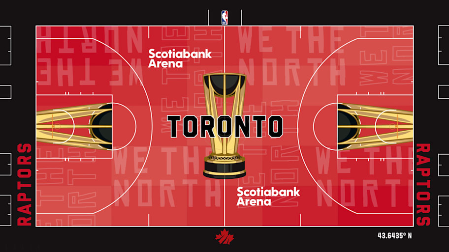
An utter disaster. With they had leaned on the maple leaf a bit more. There was potential there but red on black is a tough starting position (as will soon become clear) and the Raptors were not able to recover. Could be a fine court, but this isn’t a rug for my bedroom.
28. Washington Wizards
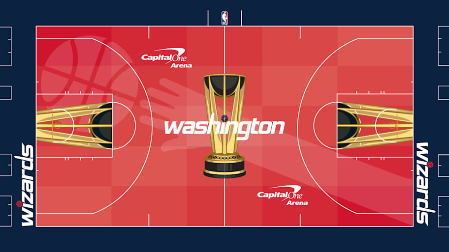
What happened here guys? Whose hand is that? I don’t know that hand. Get it out of my bedroom.
27. Los Angeles Lakers
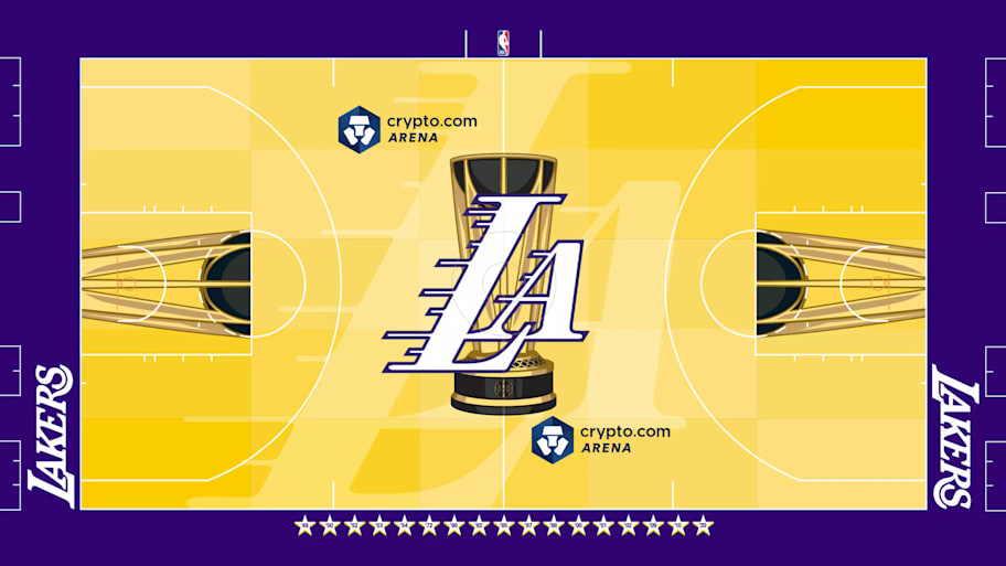
Too bright. Bad font. We get it, you’re purple and gold. Please leave me alone. You will stain far too easily.
26. New Orleans Pelicans
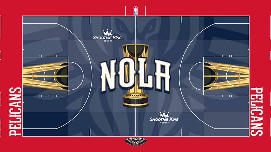
Mean bird. Too scary.
25. Miami Heat
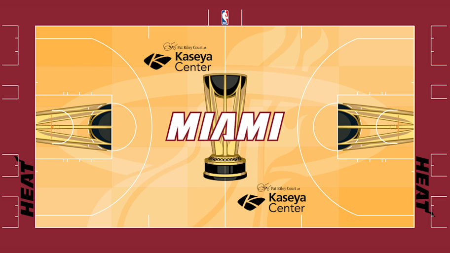
I commend the Heat for not taking the easy path to glory by riding the Miami Vice colorway on this court, but after seeing the results of their efforts maybe they should have leaned back on neon blues and pinks. It probably would make for a better court and definitely would have made for a better rug.
24. Detroit Pistons
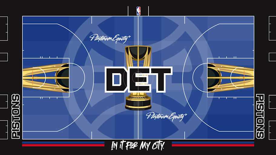
This font is jut a mess to me. The “In It For My City” at the bottom looks like they wanted to go full graffiti but got scared halfway through, and the center court DET is giving off major “IT IS YOUR BIRTHDAY” vibes. No thank you not in my bedroom.
23. Denver Nuggets
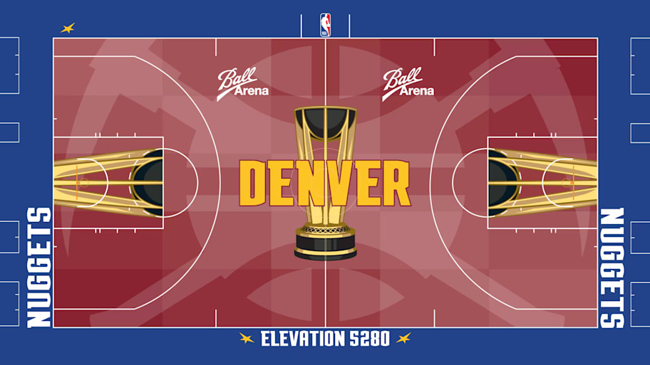
Don’t really get this one. The red that makes up the majority of the image is not a color I really associate with the Nuggets at all. “Elevation 5280” is a cool slogan for the bottom of the court, but that’s the only thing this one really has going for it to me. There’s also an uncanny valley aspect to the gold of the lettering at center court and the gold of the NBA Cup logo.
22. Phoenix Suns
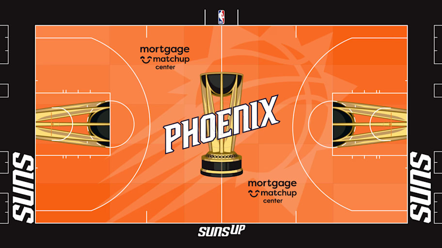
Happy Halloween everybody!
21. San Antonio Spurs
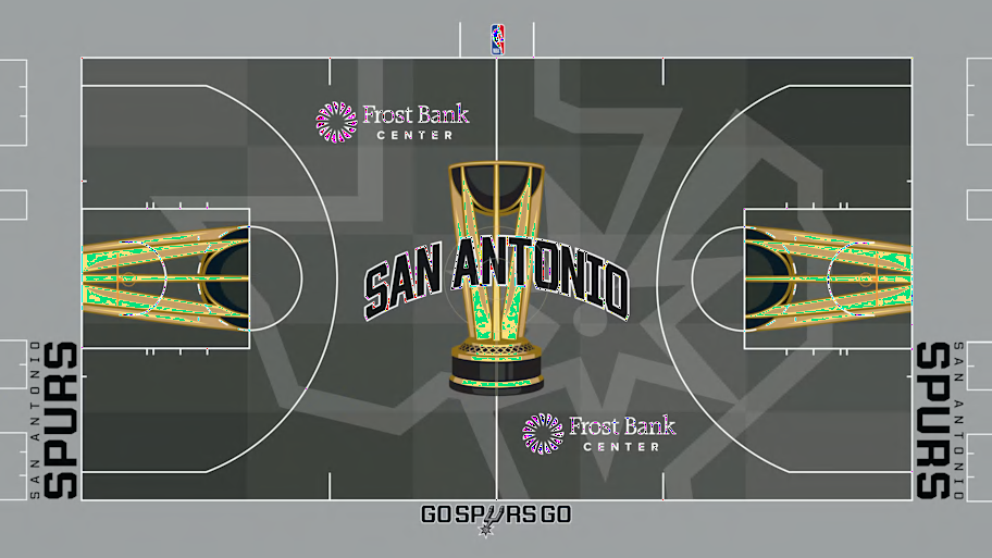
I’m sure this hits different if you are from Texas but not at all for me or my bedroom.
20. Golden State Warriors
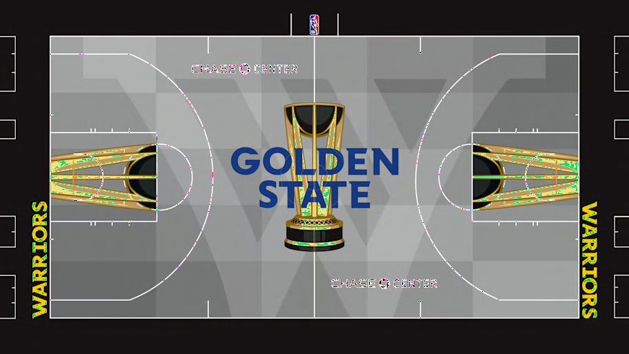
Feels like a missed opportunity here, Golden State. There’s a lot of ways to successfully use gray, especially in a bedroom rug, but this is not one of them. If I had an affinity for the letter W then maybe this would make the cut, but alas, I do not.
19. Atlanta Hawks
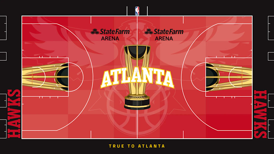
Red on black is a pretty bold look for a basketball court, and far too moody for the floor of my bedroom. Both the font and the ghostly image of the hawk coming in to attack give off an ominous vibe that I worry could infect my dreams.
18. Boston Celtics
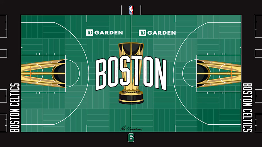
Color-wise this isn’t too bad, although the bold gold of the NBA Cup logo contrasts rather sharply with the forest green of the court. The alternating line design gives off definite rug vibes, but I would prefer not to have an ad for a bank in my bedroom.
17. Dallas Mavericks
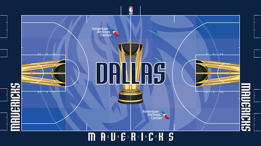
For the colors alone I really want to love this one, but one thing I do not want in my bedroom is images of animals with threatening auras, and I simply do not think that horse has my best interests at heart.
16. Chicago Bulls
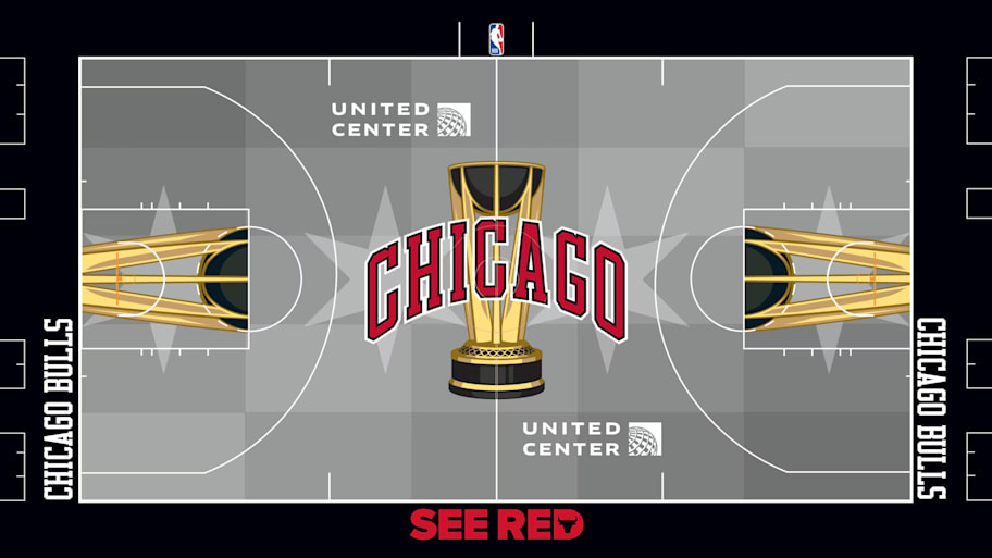
I think this is about as good as you can do when working with red on black, and the four stars of the Chicago flag make for a nice touch of local character. For any lifelong Chicagoans, this could be a great bedroom rug. But I am not a lifelong Chicagoan.
15. Charlotte Hornets
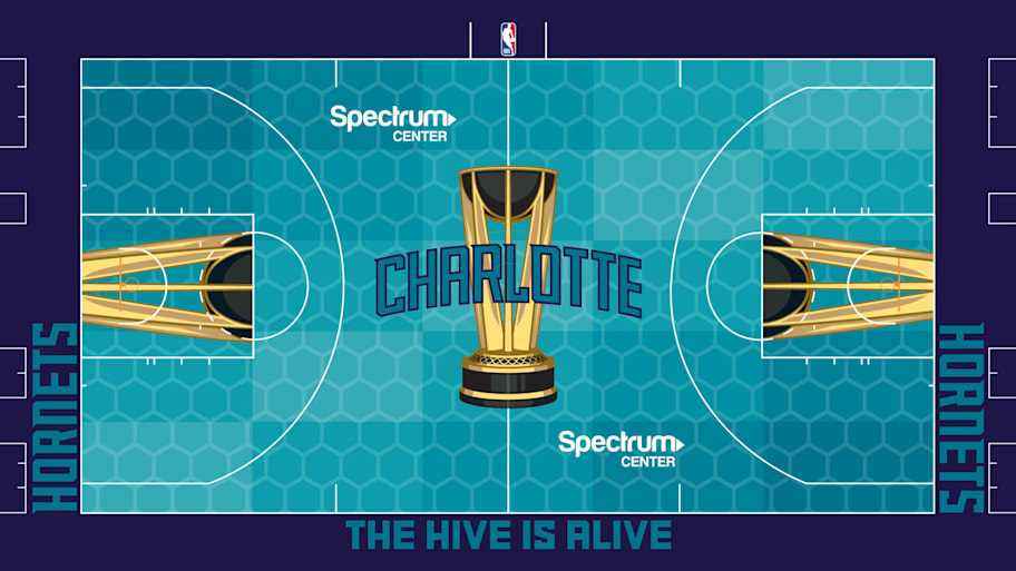
Few teams have a color scheme that goes together with the gold NBA Cup better than the Hornets, and this court is going to look extremely clean. Unfortunately, I’m looking for a rug for my bedroom. If this was going to be in the house, it is giving off more bathroom energy than bed time. Could be a great towel or shower curtain though.
14. Oklahoma City Thunder
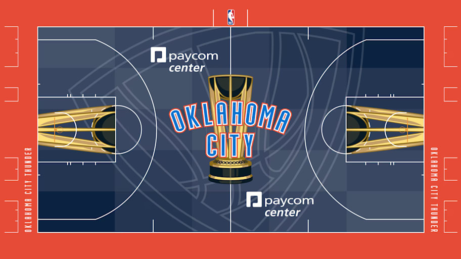
I applaud the Thunder for not going as bold as they could have gone, opting for the cool navy blue rather than the bright teal that we see on their jerseys. It’s good, but there’s not enough happening here for me to get too excited.
13. Philadelphia 76ers
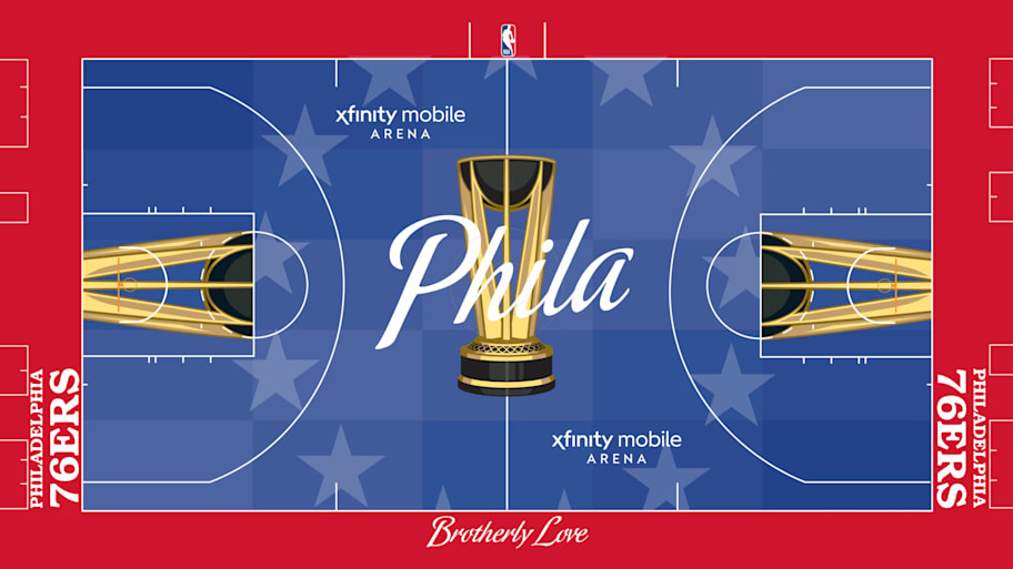
Okay stars. Okay rug.
12. Cleveland Cavaliers
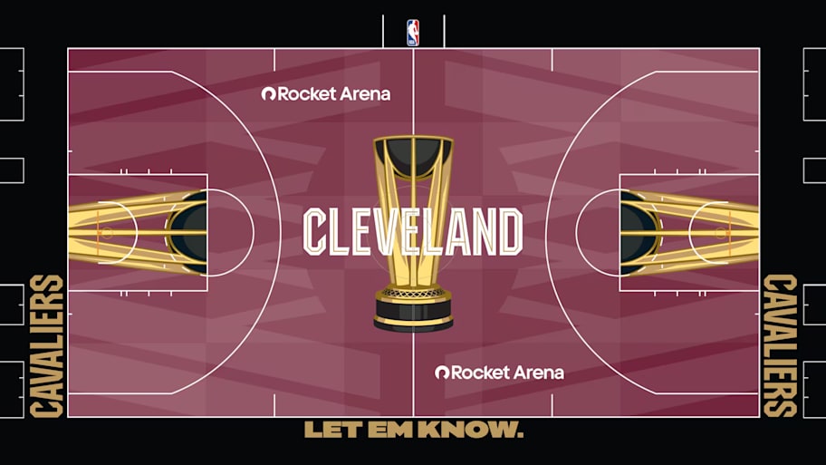
I like a lot of what is happening here. The wine color of the body of the court gives off plenty of character while also hiding stains pretty well in rug form. As far as mantras to start your day go, you could do far worse than “Let Em Know.” Depending on the color of my bed spread, I could see this one tying the room together.
11. Brooklyn Nets
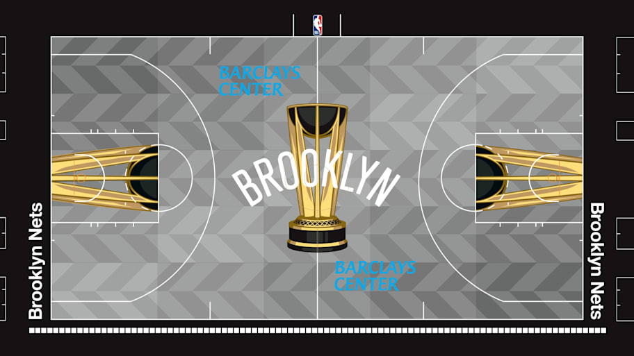
Extremely solid showing here. The NBA Cup logo adds just enough pop to the black, white and grey dynamic the Nets have going for them. The zig-zags on the court going through a grayscale fade is some quality rug action.
10. Milwaukee Bucks
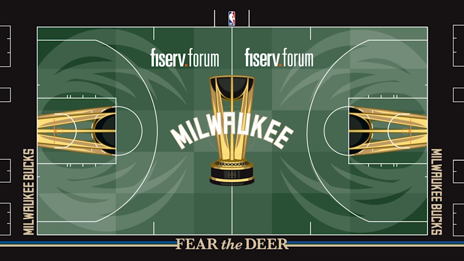
Keeping just to colors this is close to the top tier. The “FEAR the DEER” adds a regal assertion of dominance. But those horns are still a bit too sharp for my liking. This would work as a rug, but I would rather have the cheery little deer of yesteryear adorning my bedroom floor.
9. Minnesota Timberwolves
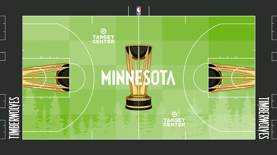
Minnesota’s court should be too bright for my liking, but what can I say. I contradict myself. Large, containing multitudes, etc. etc. But those trees. Those beautiful trees. I know I was worried about getting the other rugs dirty but this one would be worth the dry-cleaning bill.
8. Houston Rockets
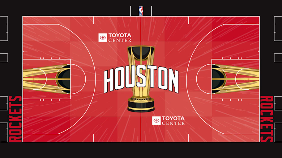
Very nice work here. While the red on black is still extremely sharp on the eyes, the lines exploding from center court give a sense of motion and whimsey and dare I say it, blasting off. It’s still probably a bit too bright for a bedroom floor, but given how many red on black courts I have complained about I wanted to highlight one winner.
7. Los Angeles Clippers
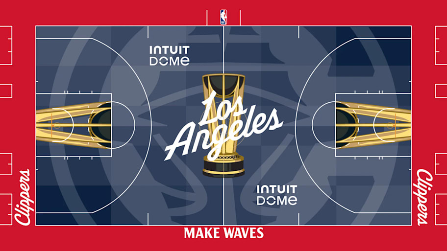
Love everything about this bad boy. While I am against animals with threatening auras in my bedroom, a ship with a threatening aura is another matter entirely. I am the captain of that ship, just as I am the captain of my bedroom, and this rug could lay in that bedroom any day.
6. Sacramento Kings
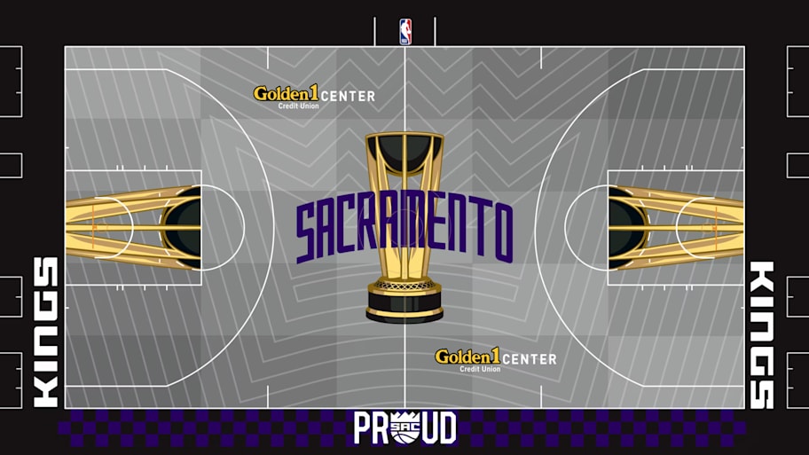
Hiding stains. Great texture. A reminder to be “PROUD” every morning when you wake up. This is a bedroom rug baby.
5. New York Knicks
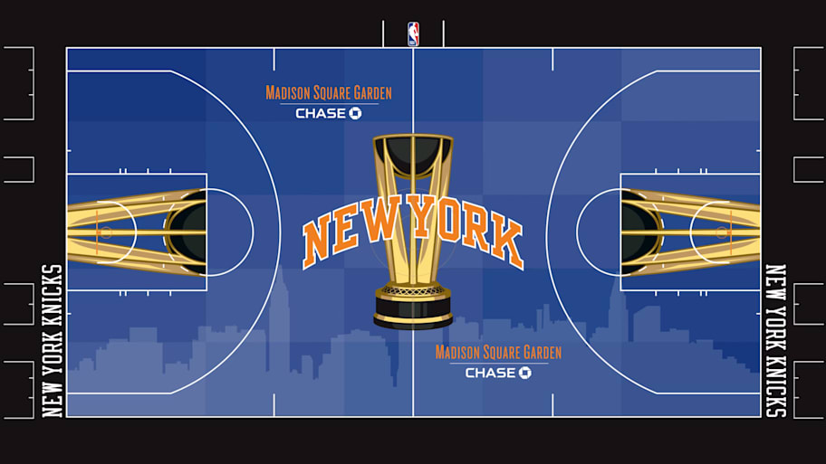
I feel like the Knicks are going to start selling this as a banner or flag for $80 at home games and I may be tempted to buy one. Only points off are for the missed opportunity of putting a “BING BONG” as the bottom tagline.
4. Orlando Magic
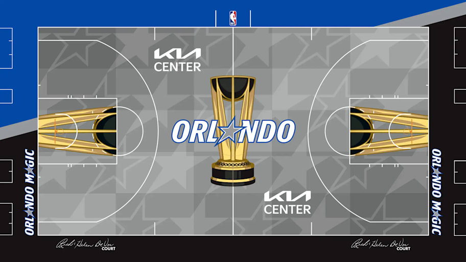
Great stars. Quality rug.
3. Portland Trail Blazers
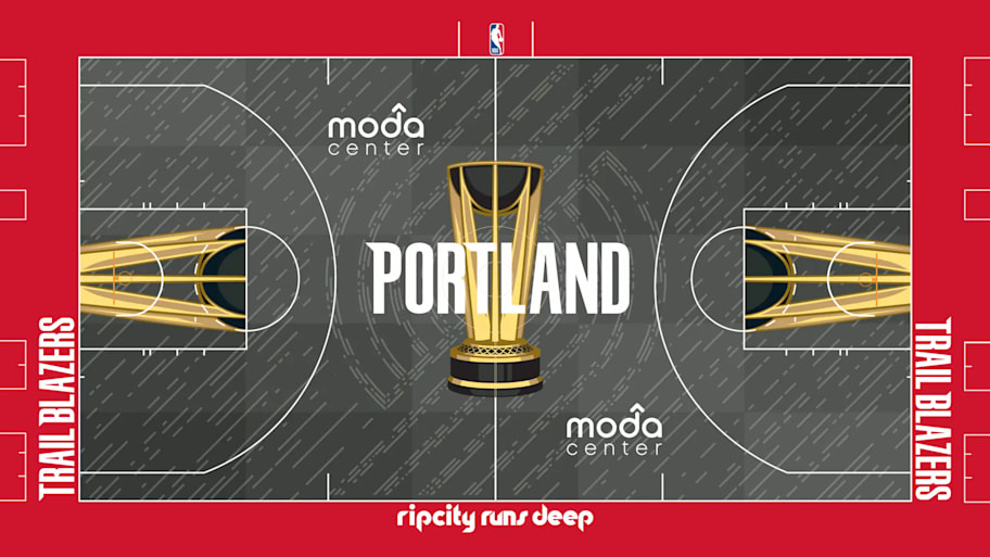
The potential textures of this rug just pop right out of the design. I already want to take my shoes off and curl my toes on it after a long flight home.
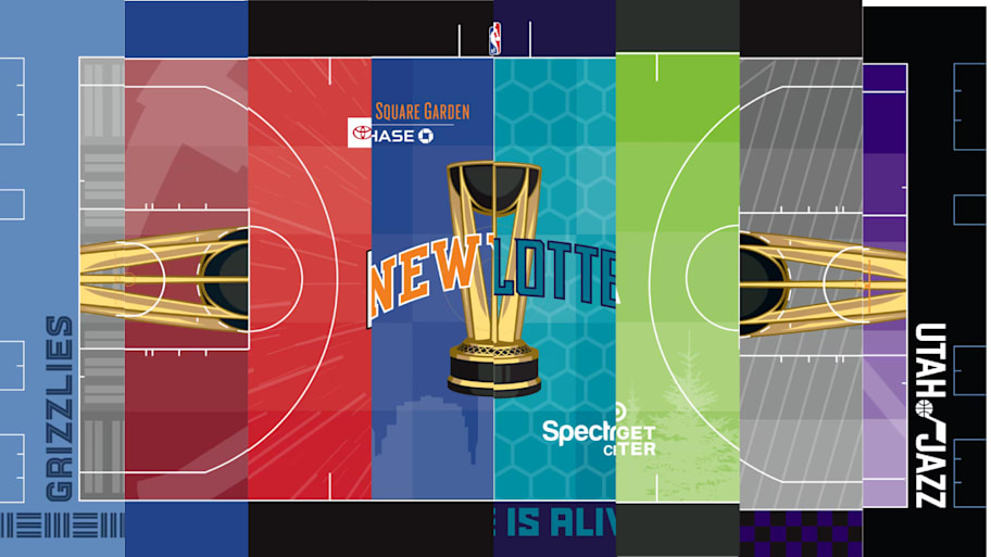
2. Memphis Grizzlies
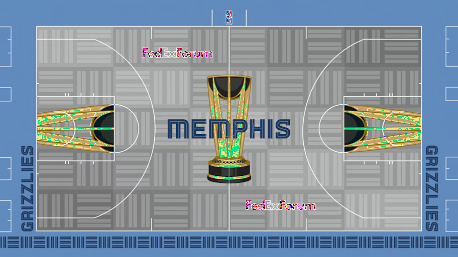
This is going to look great as a basketball court, but it truly feels like Memphis built their court to answer the question “How can we make this look great as a rug for Tyler’s bedroom?” The alternating gray lines give off fabulous rug vibes, I can basically feel the fibers under my toes on a cold winter evening.
1. Utah Jazz
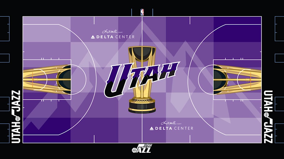
Simply a masterpiece.
More NBA on Sports Illustrated
This article was originally published on www.si.com as RANKED: 30 NBA Cup Courts Based on How They Would Look As a Rug in My Bedroom.